Wednesday, January 30, 2013

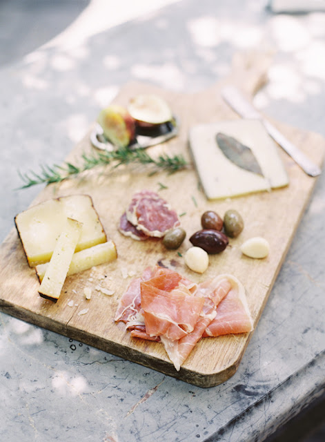
The Perfect Cheese Board


I am going to visit a friend tomorrow night and as a thank-you gift, I made her a small wood cutting board (technically I am still making it). I would like to bring some cheeses and what not to have with some wine and I thought I might do a little research on what makes the perfect cheese board.

Compliments of Martha Stewart:

#1- The perfect cheeses- and a little rhyme to help you remember- "Something hard, something soft, and something blue.”

#2- The vehicle- like crostini, crackers or a nice crusty bread.

#3- Something sweet- like fresh or dried fruits.

#4- Something salty- like whole or stuffed olives or an olive tapenade.

#5- Something with a little crunch- like nuts or apple slices.

#6- The right timing- cheese tastes best at room temperature so make sure to give them enough time to acclimate before eating.

#7- The perfect board- rustic wood cutting boards always work!

#8- The perfect wine- something thats complements your cheese selection.

And so begins the year of the handmade gift!


Hallway Light- After

I recently wrote a post on the light fixture that I wanted and then one on the light fixture that I found. Well, here are my end results! The new hallway light fixture is up and looking good. Only took me 2-3 hours to put it up. Needlesstosay, it was the first light fixture I have ever hung on my own and I now believe that is a 2 person job.


Monday, January 28, 2013

A Blog Worth a Look...


I was just referred to a beautiful blog- Roost. That seems like an odd thing to say about a blog, but I have never seen photos quite as nice as these. It is more of a lifestyle and diet/recipes blog but definitely worth a look.


Just to give you a sample of some of the photos...


 via www.roostblog.com

Wednesday, January 23, 2013

Movie Decorating

In a recent post I commented on loving the set of the movie "It's Complicated". Actually, I tend to like a lot of Nancy Meyers movie sets.

It's Complicated- the dining room and kitchen...


...the bathroom...


...the master bedroom...


...and the living room...


Although I don't love the spanish style exterior.

I also love the set of the movie "Something's Gotta Give"- inside and out.

The living room...


...the dining room...


...the pool...


...and the kitchen.


Tuesday, January 22, 2013

Update- New Hallway Light

Last week I posted about wanting a new hallway light. This is the one I was searching for...


via www.homedepot.ca

I love the look of it, the size was a little large for my narrow hallway (might be too overpowering) but I was not thrilled about the price ($250). My thinking was that I shouldn't spend more on a hallway fixture then I did on my dining room chandelier (although that was an awesome deal).

A little more research and I found...

...the Illumine 2 light chandelier ($85+ $8 shipping+ tax)...

via www.homedepot.ca

It has a similar feel to the first chandelier but much more appropriate size for my hall and a great price. Now I'm just waiting on it to be delivered!

Saturday, January 19, 2013

New Hallway Light

I am looking to replace our current hallway light fixture.

via www.toolking.com

I was watching the movie "It's Complicated" and fell in love with Meryl Streep's characters home, especially the hallway light fixture.

via gigiandoliver.blogspot.com
 

I scoured the internet (really!) trying to find that fixture and FINALLY found it (or at least something really similar)...


via homedepot.ca


Why I didn't just start my search at the Home Depot is beyond me but, the truth is, I thought the fixture would be from a high end lighting store. It is a little pricey at $250 but a great size and would throw a lot of light (4 lights). Now to wait for a sale...


Wednesday, January 9, 2013

Mixing Very Different Styles- Traditional & Mid Century Modern

My step-mom and dad are in the process of decorating their new home. My step-mom has decided to make their open concept living room into a (very large but functional) dining room.

The problem- She loves mid century modern furniture but has to decorate around a very large (and traditional) grandfather clock that has sentimental value to my dad.

via allamericanemployeeawards.com

The question- How do you, successfully merge, two very different styles like mid century modern and traditional?

The solution- A few pieces from both styles but nothing too extreme.


Above is the storyboard I made for her. Basically the grandfather clock, parsons chairs (extra dining seats and bar stools) and sunburst mirror are more traditional in style. The sideboard, table lamps and dining chairs are mid century modern. Everything else in the room will have simple, clean lines.

Wednesday, January 2, 2013

Wood Cutting Board Gallery Wall- After

A few months back, I wrote a post about how I was going to create a gallery wall of wood cutting boards in my kitchen. Well, I received 3 beautiful cutting boards for Christmas (in addition to the two boards that I already had) and here is the wall...


We used chunky, stainless steel hooks so that the cutting boards could be used and easily taken on and off the wall.


The boards really add a touch of organic to a very simple kitchen.

These are the "in-progress" pictures. I think the wall would look even better with a wooden spoon or two.

2012 New Years Resolution- Blog Related

Happy New Year!

Now that the New Year has begun, I have decided to try something new for 2012. It is clear to me that I have been neglecting the blog for the last few months. It is not that I am not doing things... I just haven't been posting them. I am especially bad at posting the after/update/follow-up pictures. So, starting this week, I will post something new every Wednesday... more if I am feeling really creative!