Just a few ideas to help those of us who don't have a lot of money to spend on decorating but still want to have homes we can be proud of.
Tuesday, February 22, 2011
Saturday, February 19, 2011
The Real High/Low Style
Have you ever read your favorite design magazine and thought what they were calling "high/low" pricing were more like "high/still pretty high" prices?
Here are some examples of actual high/low prices.
 High- Pottery Barn dining table $1299
 Low- JYSK dining table $399

High- Restoration Hardware lamp $619

Low- Canadian Tire lamp $69
 High- West Elm console table $349
 Low- Rona console table $149
 High- Structube mirror $349
 Low- Bouclair mirror $149
 High- Restoration Hardware pendant $239
 Low- Home Depot pendant $30
Here are some examples of actual high/low prices.
 High- Pottery Barn dining table $1299
 Low- JYSK dining table $399
High- Restoration Hardware lamp $619

Low- Canadian Tire lamp $69
 High- West Elm console table $349
 Low- Rona console table $149
 High- Structube mirror $349
 Low- Bouclair mirror $149
 High- Restoration Hardware pendant $239
 Low- Home Depot pendant $30
Wednesday, February 16, 2011
Pottery Barn Design Studio
Anyone who follows this blog, knows that I love the Pottery Barn website, especially their room ideas. Well now I love it even more with the launch of the Pottery Barn Design Studio. The design studio is filled with inspirational photos, advice, a room planner and entertaining ideas. Here is a little sample:


Tuesday, February 15, 2011
Living Room- Before & After
Our living room is where we spend most of our time in the house so it was one of the first rooms to undergo renovation.
Before- The biggest problem I had with the room was that it felt very closed off from the rest of the house due to the fact that the doorway into the space was very small. This also posed a problem in the summer in terms of airflow.


In progress...

After- The biggest job be did was replace the windows with doors. Not only does it make the room tolerable in the summer heat it looks sooo much better. As for the other changes in the room we added a mantel, painted and replaced the floors and trim.
 .
.
Before- The biggest problem I had with the room was that it felt very closed off from the rest of the house due to the fact that the doorway into the space was very small. This also posed a problem in the summer in terms of airflow.


In progress...

After- The biggest job be did was replace the windows with doors. Not only does it make the room tolerable in the summer heat it looks sooo much better. As for the other changes in the room we added a mantel, painted and replaced the floors and trim.
 .
.
Monday, February 14, 2011
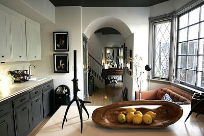
Kitchen Inspiration
Friday, February 11, 2011
Nothing Room- Before & After

There is a room in our house that essentially connects all of the different areas together. We lovingly refer to it as the "nothing room". I believe it was the dining room of the house before the addition of what is now our dining room and mud room.
Before- The previous homeowners may have used the space for dining although I am not sure how functional the table was pushed up against the wall. The light fixture was one of the first things to come down when we moved in.


After- We replaced the floors and trim, opened up the doorway to the living room, replaced the ceiling fixture with a fan matching the one in the kitchen, added some stools to the peninsula (and one day they will sit under a breakfast bar) and painted. As you can see below, Stu and I have a cabinet that is quite large but fit perfectly in the awkward corner. Rather than trying to fit too much furniture into the small space we opted for the large cabinet in one corner and a small seating area in the other corner. It seems to be the area that everyone congregates when we are entertaining.


Subscribe to:
Comments (Atom)


